


Does this design look familiar?
You might even be thinking, “Hold up, how did you get hold of my design, and why are you posting it all over the Internet?”
Or you may even be thinking, “Yeah, I visited this website last week”, only it was a different website that looked just like it.
Jokes aside, this is Linear—you’ve probably heard of them.
If you haven’t had the pleasure of viewing their website before, you’re in for a treat.
Now, you might have noticed there’s been a shift in design trends recently, everything is becoming a little darker and more glassmorphic.
Well, it’s all Linear’s fault, but it’s not a bad thing—far from it.
They’ve been setting the bar high for web design and product design, and it’s refreshing to see a company go the extra mile and really polish their design work with beautiful interactions, gradients and subtle animation.
I cannot tell you how fast I click one of their links on Twitter when they drop a landing page of some sort. I just have to see what masterpiece they’ve put out.
The problem
Okay, so Linear has been doing excellent work and getting recognition, what could possibly be wrong with that?
Well, nothing.
Until everyone gets a little too inspired.
Now, I don’t think any of these websites actually copied Linear.
Most of them I found on linears.art, a collection of websites inspired by Linear.
You could even argue they mostly look the same because they are dark. I just think it’s interesting how they all follow a similar aesthetic to Linear in some way, there’s clearly a pattern emerging in web design right now.
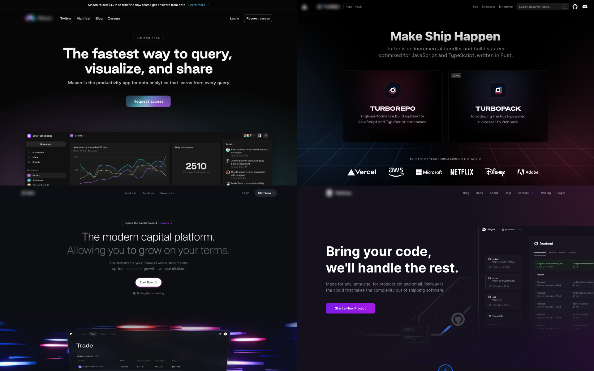
Just for fun, let’s do a quick squint test.
Squint and look at the images above, can you tell they are 4 different websites?
I’m not sure I can.
What do you think?
I can’t speak for Linear themselves, however the co-founder dropped this tweet just a few hours ago. I’m not surprised they’re thinking of changing it up so soon since everything is starting to look so similar.


The 3 rules
What do all these websites like Linear have in common?
Well, after deep, intensive research (browsing them for 30 seconds), I’ve come to the conclusion that in order to design a website like Linear you have to abide by these 3 simple rules:
1. Dark, your website has to be dark

2. Subtle blurred background gradients
These are especially effective behind product visuals.

3. Animated glowing artefacts
Bonus points if they’re interactive.

If you’ve designed a website which follows these 3 rules, chances are you’ve designed a similar website to Linear and are about to be sued for $32b.
Just kidding, but it wouldn’t hurt to be a little different.
Goodbye, old friend
You’ve been replaced.
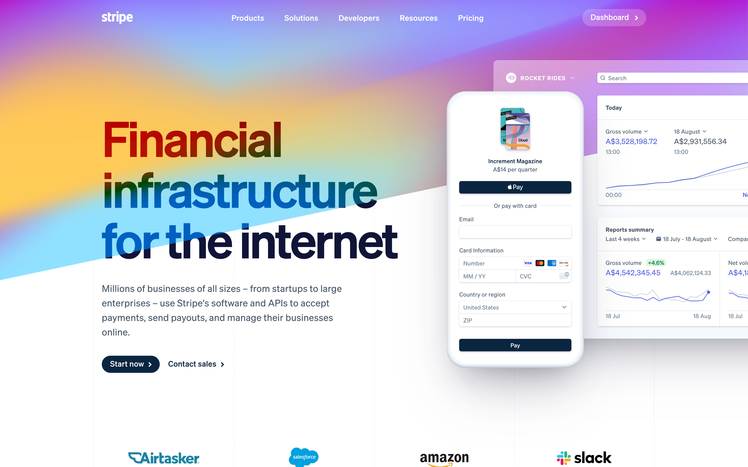
Stripe, I honestly owe so much of my design career to you.
But not for your payment processing.
Now, I’m not going to sit here and admit I blatantly copied a lot of their website in my design projects, but I also can’t say I didn’t. They were—and still are—trendsetters in design.
If you’ve been in the design game long enough, you’d know Stripe are/was the epitome of good design. When they dropped this landing page in particular, it caused a huge wave of diagonal coloured shapes in design, gradient use and duotone icons.
It wasn’t long ago that everyone looked to Stripe for inspiration.
They are the old “Linear”.
Notable website
In each edition of Rectangle, I feature one website I believe is spectacular in some way or another. Since I run Godly, I discover great websites all the time.

Pipe a finance startup with one of the most impressive website drops in a while. It's another one of those scrolling masterpieces, with each section of the website being more unique than the next.
A must check.
Link dump
A random collection of links that you might find interesting.
Wallpapers by Jerry-Lee Bosmans
A collection of beautiful abstract illustrated wallpapers for desktop and mobile devices. What’s better? They’re free.Rewind.ai
The search engine for your life. Rewind allows you to search for anything you’ve seen, said or heard.A Twitter thread on the best places to find design inspiration
Some absolute gems in here.Currently in private beta, Resend is a new email API for developers.
Loops
Delightful email creation, sending and tracking for your SaaS.VALL-E
A new AI model by Microsoft which allows you to generate speech in any voice after only hearing a 3 second sample.
Amazing stuff going on 🚀
Nice post, thanks for this ❤️